Back in the 1950s, the Swiss & Germans introduced an approach to minimalist typography style in design. This design style was a milestone in the journey away from the typical busy graphic designs. Its lasting appeal is still evident across corporate branding & communication.
Critics of the style consider this is a grid formula and results in a uniformity in design style.
Advocates argue that the style’s readability enable the designer to achieve a perfection of form. The visual style includes a visual unity achieved by asymmetrical organization on a mathematically constructed grid.
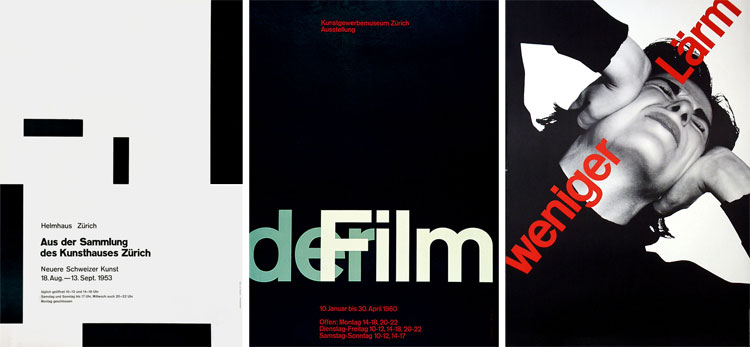
Josef Müller-Brockmann was a designer, teacher, and writer. He was in limelight as the most influential designer during the Swiss era. Müller-Brockmann style is recognizable: minimalist and free of ornamentation, he used sans serif type and a strict grid structure.
It looks illusorily simple at first glance, but minimalist design can be one of the key element to achieve & fulfill desire outcome in design.
However, there are some examples to understand minimalist typography done by Josef Müller-Brockmann: